
Art by Christopher Carter
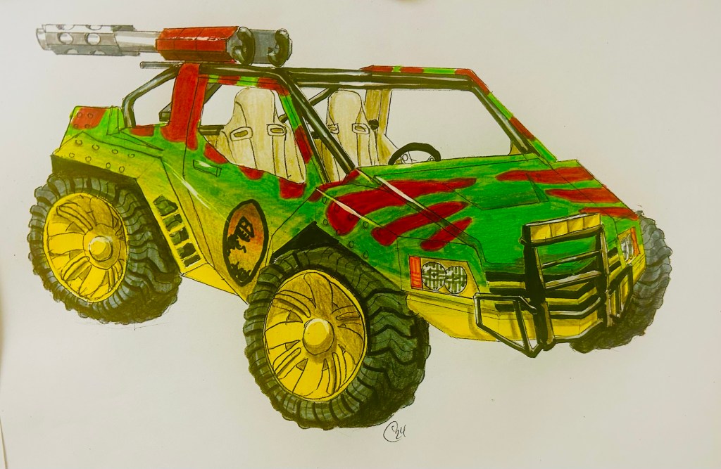
Continuing with the classic Jurassic Park paint jobs, I had to see what one of these looked like with the classic Ford Explorer motif from the movie. I love how these colors compliment and contrast each other. I still regret the lack of a number livery but whatever. Also, for some reason, I photographed these before I put the Jurassic Park lettering over the logo.

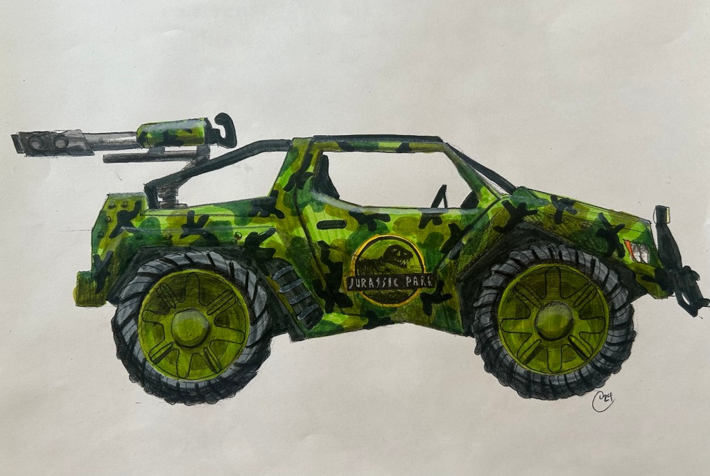
These (above) don’t appear in the Jurassic Park arcade game with this color scheme so naturally it HAD to be done. One color scheme that WAS in the game was a camouflage pattern. I don’t know that my version matches the game version so much but I like my camo version the way I did it. (Below)

It was tricky getting all the splotches in the same spot on both angles so it looked like the same vehicle. Here’s a screenshot of the original:

It’s fairly close now that I look at it again. I didn’t see the point in a camouflage vehicle with bright red wheels and a red logo on the side. It compliments the green well but it doesn’t make practical sense so I went with a green logo and wheels. I like the results. The above screenshot also gives you an idea of the fleeting visuals from the game. This is about a good a view as you ever get. It’s a fun game though, very action packed. That’s why it doesn’t linger on anything for long.
Now we’re getting to the really fun stuff! I had my own ideas for Jurassic Park color schemes. Like what if there was a part of the park devoted to volcanoes? They always have a volcano or lava level in the video games, Jurassic Park games or what have you. Or what about an ice age level? I always thought it would be cool to see some mastodons in a Jurassic Park movie. These thoughts inspired the lava and ice JP vehicles, two color schemes of my own contrivance:
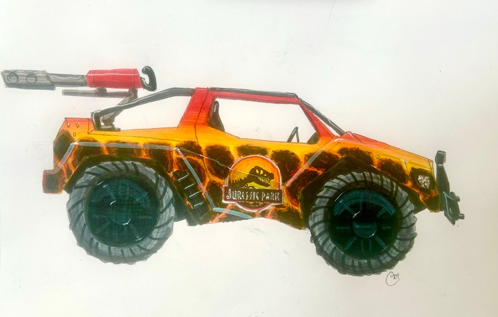

I really had to think long and hard about how this scheme would work (above) and getting the right colors in the cracks between the cooled lava. Some have said it looks like a giraffe print, others a cheetah. This irritates me. It’s Jurassic Park not Wildlife Safari. Giraffes and Cheetah’s are livestock at Jurassic Park. Oh, well. I see lava, so it’s good enough for me. And naturally I couldn’t do fire without doing…

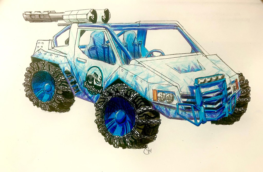
Ice! I love this color scheme! It was a fun challenge to make this very abstract design appear the same on both angles. The elf-eyed will notice I changed the logo on the side to a mastodon skeleton and it now says “Pleistocene Park” to go with the ice age theme. This was one of the first physical changes I made to the line work with the addition of snow chains to the tires. I drew them right over the previous lines and then colored the tires, accommodating for the chains. It worked so well it got my gears turning for other slight changes I could make.
I think I must’ve got interrupted between coloring one wheel and the other which explains why the front wheel on the quarter-turn angle view looks bluer than the back wheel.
I have more ideas for my own Jurassic Park color schemes plus I’ve seen some unique examples in real life too that I’d like to replicate. But I haven’t gotten around to doing those yet. I went a different direction instead.
Click below for Part 3!

Leave a reply to Vehicle Art (Part 1) – Professor Popinjay's Compendium of Perspicacity Cancel reply